

A landing page is a webpage designed to persuade users to take one specific action. For example, having users sign up for a newsletter, purchase a product, or RSVP for an event.
Users typically arrive at landing pages via a pay-per-click advertising campaign. But they may also find your landing page through your homepage, social media posts, organic search results, and email campaigns.
Like your homepage, landing pages are often the first experience visitors have with your website. But homepages and landing pages serve different purposes.
Homepages contain general information about your company. They’re a gateway to other pages on your site where the visitor can learn more.
Landing pages, on the other hand, are standalone pages focused on driving conversions.
In other words, landing pages are where you turn visitors into leads and customers.
How Landing Pages Work
The landing page should be your visitor’s last step before they convert. (That is, when they become a customer or a lead.)
Landing pages are great for:
- Getting email newsletter signups
- Selling a product or driving pre-orders for it
- Distributing marketing material, like ebooks and catalogs
- Linking users to an app download
- Registering users for an event
- Scheduling users for a product demonstration or sales call
Landing pages are not so great for:
- Presenting several different products or services
- Linking to other pages on your website
- Telling your company story
Your visitors should arrive at your landing page as a result of your marketing strategy. For example, they might click on your ad in Google’s search results or a post on social media.
Users can also be directed to a landing page from your website itself. For example, if you publish a blog post describing a product, a button placed in the content could link to a landing page to buy that product.
How to Create a Landing Page
A landing page is designed around a single action. If a user comes to your landing page and gets distracted, they might not complete that action.
So it’s important to keep landing pages as simple as you can.
For example, landing pages generally shouldn’t include a top navigation menu.
That’s because a visitor to your landing page is very close to making a purchase. If they leave your landing page to go read your latest blog post, you might lose out on a sale.
Here’s what a typical landing page looks like from the company Slack. It’s simple, clean, and direct.

Effective landing pages are built around a few key elements. Let’s explore how to create them now.
Hero Image
The hero image is a graphical element designed to make your landing page more visually appealing.
It’s big. And eye-catching. And located near the top of the page. Like this one:

Or this one, which sits behind the text:

Some companies use hero images that show a literal representation of their product or service.
For example, if you run a food delivery service, your hero image might be a photo of delicious-looking food:

Other companies’ hero images don’t show the product or service at all. But they can still create a positive first impression with the brand.
Like this landing page’s colorful illustration of two people standing atop a hill:

To find a picture to use for your hero image, check out the free stock image libraries at Unsplash, Pixabay, or Pexels.
Headline and Subheading
A catchy headline engages the visitor and helps them understand your offer.
The headline could be a value proposition. Like this:

Or it might describe what the visitor can expect when they click through. Like this discount offer from Spotify:

Some headlines are followed by a subheading. It’s written in a smaller font than the headline and provides more details and an additional nudge to get people to convert.
For example, Showtime’s landing page has the headline “Start Streaming Showtime Now.”

And underneath that, a subheading contains details about the length of the trial period and pricing:

Here’s a formula you can use for your headline and subheading:
Headline: [Main benefit they’ll get, in about 10 words or fewer]
Subheading: [Details or additional benefits, in under ~20 words]
Supporting Copy
This is the text that describes your offer with more detail. It’s usually a few sentences long.
Not every landing page needs supporting copy. Often, a headline, a subheading, and an attractive hero image will do the trick.
But sometimes, adding extra details can convince people to take action.
For example, check out the supporting copy on Audible’s landing page. It describes an additional benefit that isn’t mentioned in the headline or subheading:

If you’re not sure what to use for supporting copy, ask yourself: “Is there anything important that can’t fit into the headline and subheading?”
If so, add it here.
Try to keep it brief. Use bullet points to highlight the most important details.
Forms
For lead generation landing pages, you’ll need to include a form for the user to enter their information.
(Otherwise, you won’t get the lead.)
You can ask for as much information as you want. But the more fields you require, the fewer people will typically fill them out, according to an analysis from Hubspot.
In fact, to maximize conversions, many businesses ask for just a single piece of information:
An email address.
But some businesses also ask for information like the person’s name, phone number, location, and more.
That can be worth doing if the additional info will help you sell to them later.
For example, say you sell both cat toys and dog toys. In that case, you could add a field asking what kind of pet the visitor has.
That way, when you send marketing emails to them later, you’ll be able to feature the products they’re most likely to buy.
Call To Action
A call to action (CTA) is a button on the landing page. When clicked, it brings the visitor into the next step of the interaction with your business.
Some reasons a visitor might click on a CTA include:
- To purchase a product or service
- To install an app
- To sign up for an event
- To download an ebook
- To subscribe to a company newsletter
The CTA should be prominently displayed. Some landing pages place it immediately after a headline or subheading.
Like this:

If your landing page includes a form, the CTA will come after it.
In these cases, clicking the CTA will submit the information entered in the form.
Here’s an example from our own landing page:

The label on the button should indicate what’s going to happen when the visitor clicks it:
- For example, if the landing page is for newsletter subscriptions, the label might read “Sign up.”
- If the landing page is for a free trial of your product, the button might read “Try it now.”
- If the next step after the user clicks is a product flow, the button might read “Get started.”
- If the next step is to finalize a purchase, the button might read “Buy now.”
It’s also a best practice to include your CTA multiple times on the page, especially for longer landing pages.
For example, an additional CTA might follow your supporting copy. That way, any visitors reading your supporting copy won’t have to scroll back up to convert.
Landing Page Examples
Let’s explore how some landing page examples utilize the page elements we covered above to maximize conversions.
1. Bestow
Bestow is an online life insurance broker. This is what its landing page looks like:

It contains a hero image of two children standing in front of some kind of hedge. It’s a visual reminder that life insurance is meant to protect your loved ones. Without showing the product itself.
The landing page’s headline and subheading both explain that applying for their product is easy and contains “no hoops” and “no headaches.”
One sentence of supporting copy gives one additional detail: the specific type of life insurance offered by Bestow (“no medical exam” life insurance).
There are also two CTAs on the page.
One says, “Get a Quote.”
When you click through to the next page from there, you’re asked to enter some information about yourself:

This type of page has two functions.
It lets you, the business owner, learn more about your customer base. So if the user doesn’t convert on this visit, you can market to them later.
It also provides a service to the visitor: a free quote on life insurance premiums. This can help them make a decision to purchase life insurance from you.
The other button on Bestow’s landing page reads “Apply Now.”
This is for users who don’t need additional information about life insurance, such as free quotes. They’re ready to apply for coverage.
When clicked, the “Apply Now” button takes the visitor to a page that looks like this:

As you can see, it asks some of the same questions as the “Get a Quote” page. But it also includes more personal questions, like the visitor’s home address.
When a customer fills out this form, the company will determine if they qualify to purchase a life insurance policy.
Then, they can purchase the policy. So the landing page could result in a sale with just a handful of clicks.
2. LinkedIn Premium
LinkedIn’s premium service comes with a one-month free trial.
You can access the trial on their landing page. Which looks like this:
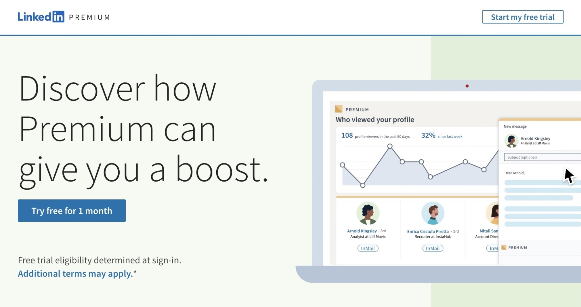
Here, the hero image is a cartoon of LinkedIn Premium in action. It features a function that isn’t available to non-premium subscribers.
It also contains a large headline that entices the user to click.
And it contains two CTAs. One is a button that says, “Try free for 1 month.” And the other is a button in a different style that says, “Start my free trial.”
Having more than one CTA gives users extra opportunities to click into your offer.
If people are focused on the top of the screen, they might click the button in the upper right corner.
But if they needed that extra push from the headline, the user might be more inclined to click the button that follows it.
And both CTAs lead to the same page.
A login form.

By linking to a form like this, you can accomplish two things.
If your customer already has a free account with you, they can be sold on an additional product after logging in.
And if the customer doesn’t have an account, they’ll be able to make one in order to claim your offer.
So even if they don’t end up signing up for the trial, you’ll be able to reach them with additional offers later.
3. Tor Books
Tor, a publisher of science fiction and fantasy books, offers a free ebook each month.
This is what its landing page advertising the offer looks like:

An image of the book’s cover serves as the hero image.
A headline details the offer: a book-of-the-month club. And a subheading gives an exciting one-sentence summary of that month’s book.
And there’s also a lot of supporting copy describing the plot of the book. This is extra important. Because without knowing what the book is about, it’s unlikely that users will want to read it.
There are also two CTAs.
One is a button intended for people who are already Tor customers. If you’ve already subscribed to Tor’s book-of-the-month club, you can click the “Confirm Now” to get the free ebook.

The other CTA is a form asking users to fill in some information and agree to terms and conditions. Two options at the end of the form invite visitors to sign up for a newsletter.
Followed by a button labeled “Sign Me Up!” to submit the form.

Having these two CTAs means you can convert even more users.
A returning customer might still be interested in reading a free book, and this could lead them to purchasing additional books by this author.
And a new customer who downloads this free book may opt to receive your newsletter.
That means more opportunities to sell them books in the future. And keep them engaged with your company.
Optimizing Your Landing Page for Search
In general, one of the most important ways for potential customers to find your website is through organic search.
But, remember, landing pages are for visitors who are ready to convert.
You can tell when visitors are ready to convert because they are searching for highly specific phrases.
If they’re not ready to convert, the phrases they’re searching for will be more general and shouldn’t lead them to your landing page.
Here’s an example.
If a user searches for “Uber,” the first match they’ll see links to Uber’s homepage, where they can learn more about the ride-sharing company.

But when users are ready to convert, the searches they make are more specific.
Here’s what it looks like if the user searches for “Uber sign up.”

One of the top results is Uber’s landing page, where visitors can sign up to become a driver.

So, to optimize your landing page, you need to be selective about which keywords you target with it.
The first step is to find those keywords through keyword research.
But your landing page has a specific function: increasing conversions. So you only need to target specific keywords.
As a rule of thumb, the more specific a keyword is, the more likely the person searching for that keyword will convert.
That’s because that person has a very clear idea of what they’re looking for.
Here’s another example.
Mailchimp and Klaviyo are two companies that both offer a marketing automation platform. They are competing for similar customers.
Klaviyo could try to capture some of Mailchimp’s users by making a landing page highlighting the differences between the companies’ offerings.
Like this:

If you were optimizing this landing page for search engines, you could use Semrush’s Keyword Research tools to find variations on keywords related to Klaviyo and Mailchimp.
The keyword “klaviyo vs mailchimp” is a good start:

If you click on these keyword suggestions, you’ll see additional suggestions for optimizing the landing page. For example, users have questions about pricing. Or about integration with other platforms, like Shopify.

So having content on your landing page to answer those questions could get it to rank higher than pages that don’t answer those questions. And it might convince visitors to click on your CTA and convert.