

A majority of all website visits worldwide are attributed to mobile devices. Optimizing your website for mobile has never been more important in SEO.
In this article, I’ll kick things off by explaining what mobile SEO is and why it’s important. I’ll then get to the core focus of this article, sharing my top 10 tips for effective mobile optimization.
Mobile SEO is the process of optimizing the mobile version of a website to drive organic traffic from search engines. Mobile optimization is focused on providing the best experience on mobile devices where technical implementations, such as using responsive design, play a key role.
According to Statista, mobile devices generated 59% of worldwide mobile traffic in the final quarter of 2022.
It’s not just users that predominantly view your site from a mobile device, but Googlebot too.
In 2016, Google announced mobile-first indexing. As a result, Google predominantly crawls the web via the Googlebot smartphone user agent. This means that Google will primarily use the mobile version of content for indexing and ranking.
Mobile-first indexing began rolling out in 2018. By 2021, a majority of sites moved over to the new format of crawling.
For many years, this was a hot topic among SEO professionals. However, mobile-first indexing is now “part of life,” as put by John Mueller from Google.
So now we know why mobile optimization is so crucial, here are my top 10 tips to ensure you effectively optimize for mobile.
Tip 1. Use responsive design
When it comes to picking your approach to serving content to different devices, you have a few options to choose from.
Responsive design (recommended)
With responsive design, you serve the same HTML file regardless of the device. CSS then alters the rendering of the page to suit the dimensions of the device’s viewport. This also means that you use a singular URL to serve all versions of your content.
Responsive design ensures you can effectively load the same piece of content, oriented to suit your device.
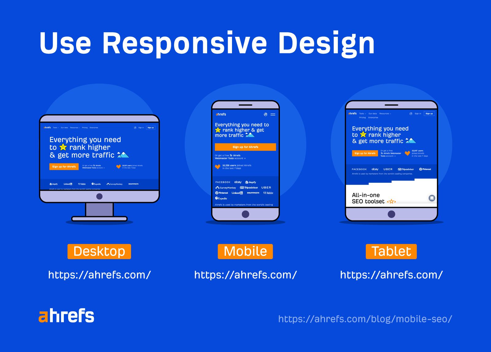
Responsive design is the recommended choice, not just among SEOs but in Google guidance too.
Back in 2019, John took to Reddit to state, “At some point all of these sites with separate mobile URLs should just move to a responsive design.”
Ultimately, there’s no SEO gain by using responsive design. However, it is much easier and cleaner to maintain. For example, you won’t have to worry about canonical issues or Googlebot misunderstanding which URL to serve in the mobile/desktop rankings.
Separate domain/URL structure (not recommended)
An approach used commonly in the past is to serve the mobile version of a page via a separate URL or domain structure. A common example of this is the m. structure.
Desktop: example.com/page
Mobile: m.example.com/page
When a user loads your page, the server will have to determine which device the user is using and then direct them to the appropriate URL.

This approach is not recommended, as using multiple URLs for a single page leads to a messy scenario of URL management.
Even with the correct signals in place, there is the added risk of Googlebot not interpreting these signals appropriately. This can lead to indexation issues or even Google identifying the pages as duplicate content.
If you currently work with this setup, you should ensure you follow the below canonical tag structure.
Desktop: Self-referencing canonical tag
Mobile: Canonical tag to target desktop URL
You’ll also want to implement a rel=”alternate” tag on the desktop version.
<link rel="alternate" media="only screen and (max-width: 640px)" href="https://m.example.com/">
That said, the best solution in the long term is to move to a responsive design setup.
Dynamic serving (not recommended)
Similar to responsive design, with dynamic serving, you’ll be serving content suited to different devices via a singular URL.
However, the main difference with dynamic serving is that you’ll serve different HTML files pre-defined to suit the respective device.
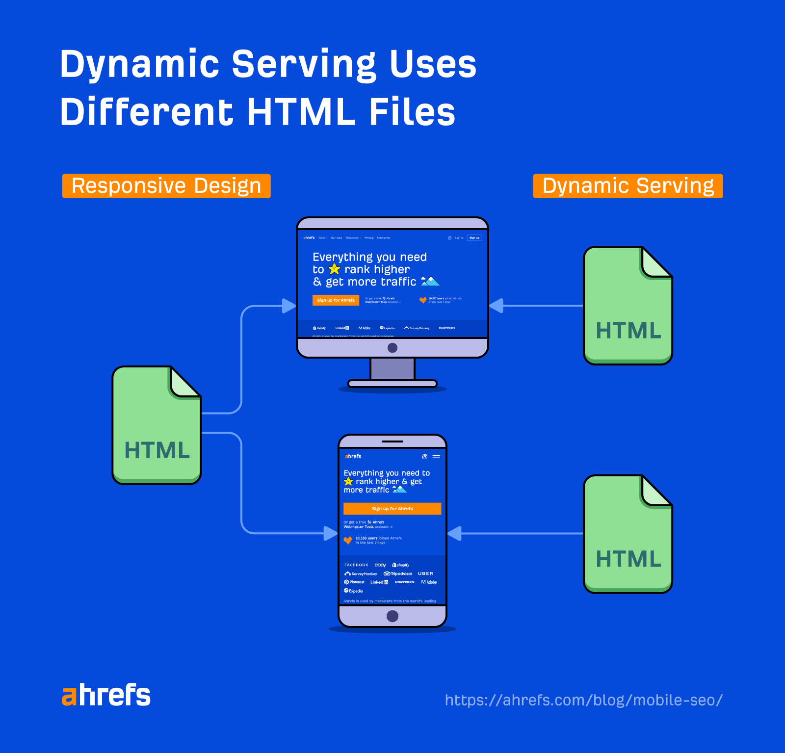
This approach certainly trumps the separate URL/domain structure option, as you have the advantage of serving content to multiple devices via a single URL.
However, dynamic serving is not recommended. History teaches us that this approach is renowned for technical issues.
With dynamic serving, it’s up to your web server to determine which device the user is browsing on. Quite often with dynamic serving setups, the desktop version of the page is accidentally shown to users on a mobile device.
Tip 2. Optimize for page speed on mobile devices
In the era of Core Web Vitals, you could argue that strong page speed performance has never been more sought after by SEO professionals.
In fact, when Google first rolled out Core Web Vitals as a ranking factor in 2021, it focused solely on mobile performance. Google then waited until February 2022 before using desktop Core Web Vital performance as a ranking factor. It’s clear to see which device Google prioritizes.
Google applies mobile and desktop Core Web Vital ranking signals to the respective search results. So for mobile search results, Google will focus on Core Web Vital performance from mobile devices.
A great starting point to see how your site performs against Core Web Vitals is to head to the dedicated report in Google Search Console (GSC). You can navigate to this report via left-hand navigation under the Experience section.
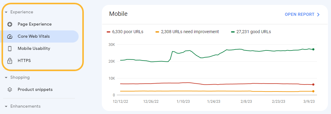
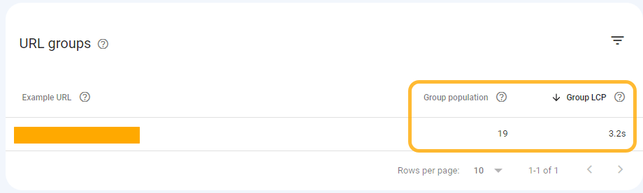
Clicking into the mobile report, you can see how your site has been performing against each Core Web Vital metric over the past three months. This data is gathered via CrUX (Chrome User Experience Report) from real users on your site who used a mobile device.
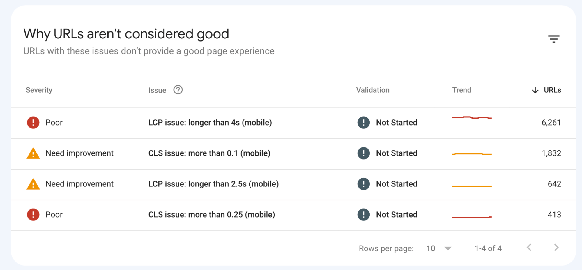
What’s great about this report in GSC is that the issue URLs are bucketed together into groups of similar pages. This means you can note down a list of key page templates that you need to work on.
For a more detailed insight into issue areas and potential fixes, PageSpeed Insights is always worth a check.
PageSpeed Insights is simple to use. Just enter in the URL of the page you wish to test and hit “enter.” By default, the tool will automatically review the mobile version of your page.

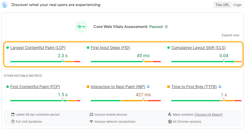
You’ll initially be presented with some insights under the heading “Discover what your real users are experiencing.” This report is the main one I focus on, to start with.
This report utilizes real user data via CrUX. Not only is it important to understand the experience of real users as opposed to bots, but Google also uses this data source within its ranking algorithm.
Here, we can see that Ahrefs’ homepage has passed all three Core Web Vital metrics.
Further down the report, you can also find some actions under the “opportunities” and “diagnostics” sections. These make for some great starting points when having conversations with developers about improving Core Web Vital performance.

When using PageSpeed Insights, don’t forget to test the URLs of multiple page templates within the tool. Page speed performance often varies considerably across different page types.
We’re only scratching the surface here, though. GSC and PageSpeed Insights are only great starting points for auditing page speed.
Check out Patrick Stox’s dedicated guides on page speed and Core Web Vitals to take your page speed knowledge, analysis, and action plan to the next level.
Tip 3. Test and monitor your site for errors
It’s good practice to regularly test your site for key mobile usability errors.
There are multiple tools for this, but a great place to start is via GSC with a dedicated “Mobile Usability” report. You can find this report under the Experience section of the left-hand navigation.
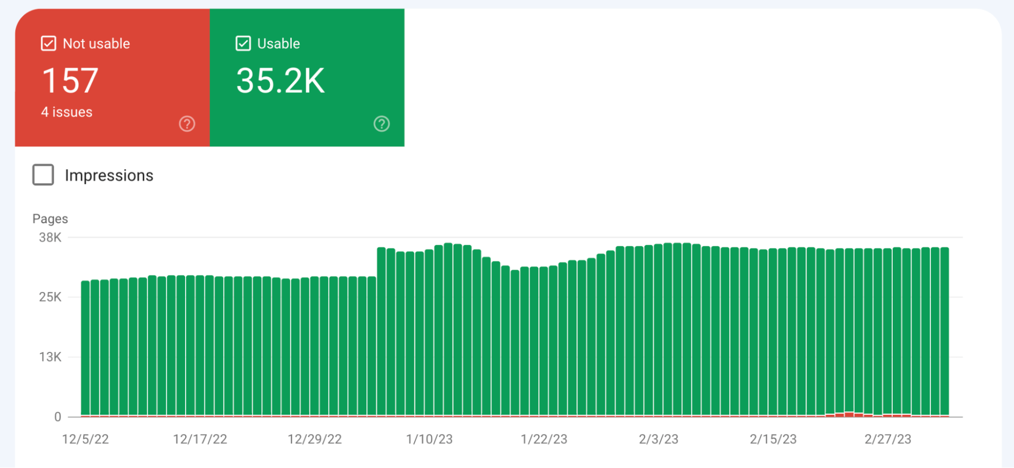
Here, you can keep track of the number of URLs with mobile usability issues. GSC provides a three-month velocity graph. This is handy for identifying spikes in errors, allowing you to correlate them with development releases.
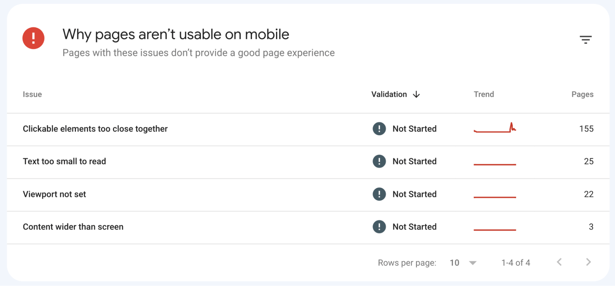
By scrolling down, you can see the exact mobile usability issues that occur on your site. By clicking through to the individual reports, you’ll also be able to see which URLs are affected.
Outside of Search Console, you can also use Google’s Mobile-Friendly Test tool to uncover mobile usability issues.
This is especially useful if you don’t have GSC access to the site you wish to review. Gaining access is recommended though, as you’ll automatically have a wider range of URLs covered.
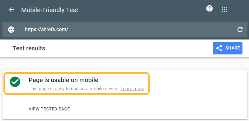
To use the Mobile-Friendly Test, simply enter the URL (or code) for the page you wish to test to see if your page is deemed as mobile-friendly.
In this case, the tools show that the Ahrefs homepage has passed the test.
On the other hand, if your tested page isn’t mobile-friendly, you’ll be hit with a message saying it’s not usable on mobile with a list of reasons why.
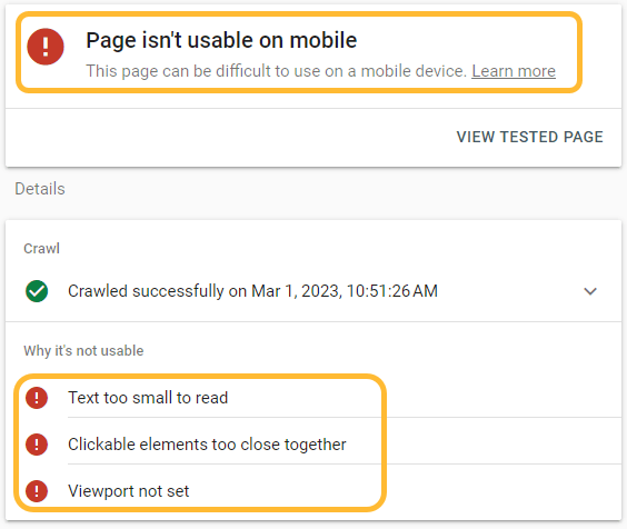
Keen to read more about specific mobile usability issues and how you can address them? Google has some great documentation that goes into more detail.
Tip 4. Make your content mobile-friendly
Making sure your website is optimized for mobile isn’t all about technical foundations. You’ll want to ensure your content is produced with mobile users in mind too.
Many SEOs prefer to use shorter paragraphs and sentences. This aligns nicely with mobile optimization practices.
This approach ensures that your content is readable on mobile devices. Who lands on an article and wants to read a big wall of text? Not me.
As a general guide, aim for a maximum of three sentences per paragraph. If a paragraph naturally just has one sentence, that’s OK too.

When proofing copy drafts, it’s good practice to break long sentences into shorter sentences where possible.
The same rule applies to introductions. In fact, you should apply these rules most strictly here. These should be short, snappy, and to the point.

To further enhance readability, you’ll want to break your copy up by including various elements and media.
These can include:
- Bullet points
- Numbered lists
- Quotes
- Images
- Videos
See what I just did there?
When using different types of media, you’ll want to make sure these display correctly on mobile devices. It’s so frustrating for users when an image loads way out of proportion.
Tip 5. Optimize for mobile SERPs
Mobile SERPs (search engine results pages) can vary quite considerably between the mobile and desktop versions.
When browsing the SERPs for a chosen keyword, it’s important to manually check both the desktop and mobile results.
Here’s an example. Let’s take this wikiHow search result for the query, “how to fry an egg.”
On the desktop search results, we have a pretty standard search result.

On the mobile results, however, we can see that Google has included the how-to images rich result.

SERP estate is crucial. Gaining rich features like in the example above helps your result stand out from the crowd.
This shows how important and relevant schema markup is for mobile optimization. In this example, wikiHow did a nice job by including how-to schema.
Looking to switch device in the search results but don’t want to grab your phone? With Ahrefs’ SEO Toolbar, you can load the results from another device directly in your desktop browser.
Tip 6. Include mobile-friendly navigation
One of the biggest considerations when optimizing your site for mobile devices is the choice of implementation for the header navigation.
This is quite easily one of the most complicated areas of the site to get right for a mobile device.
The hamburger menu has become a popular option in the mobile-first world. It gets its name because the button often looks like a hamburger (apparently).
Here’s an example of the hamburger menu in action on Amazon.

Once you click on the “hamburger” icon, usually located at the very top of the page, the menu will then open out.
In this case, the menu opens out from the left-hand side with options to further expand into navigation subcategories.

Hamburger menus are hotly debated among SEOs and UX professionals. In my opinion, however, you can’t beat the hamburger navigation when it comes to optimizing for mobile.
Not only is this approach clean and compact, but users are also becoming more accustomed to these types of menus on mobile.
It’s OK to go with the “mega menu” approach for your desktop site and switch to the hamburger menu for your mobile site.
The number #1 rule is to ensure that the links within both menus are the same. You’ll want to make sure that you include the exact same links on both your desktop and mobile navigation.
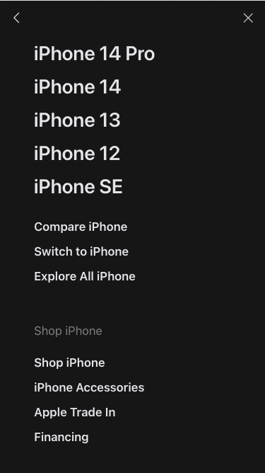
Here, we can see that Apple displays the mega menu on desktop.
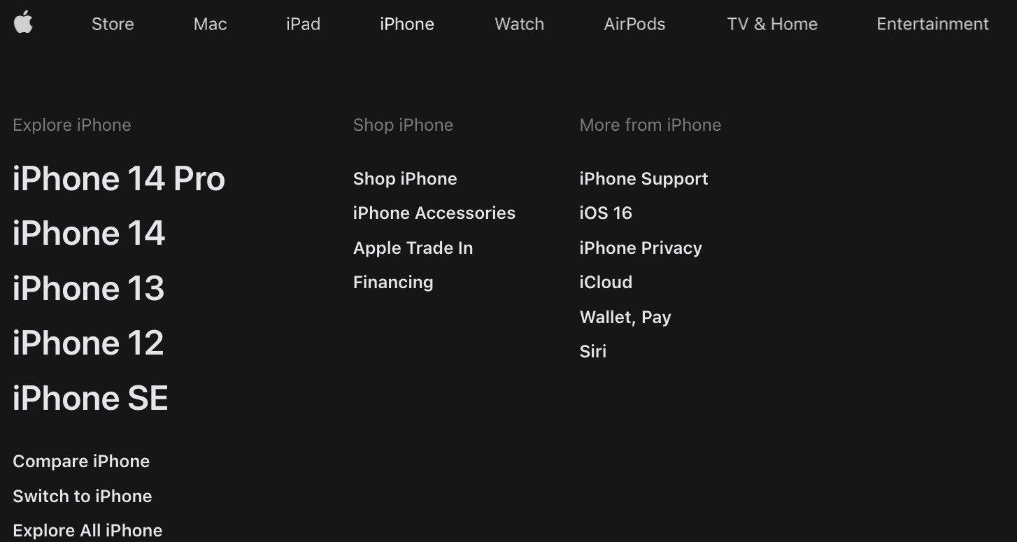
And on its mobile site, it uses the hamburger menu but shows the exact same links seen on the desktop version.
For e-commerce websites, faceted navigation is a big consideration too.
Let’s take a look back at Amazon. It has tons of filter options on its product listing pages.
To keep the faceted navigation compact for mobile users, it uses a similar approach to the hamburger menu.

Allowing the faceted navigation to expand on a simple button click keeps your page neat and compact. Perfect for mobile users.
Keen to learn more about site navigation? Be sure to check out Sam Underwood’s article on mastering website navigation.
Tip 7. Keep your content the same
Parity between your site’s mobile and desktop versions is essential. As we mentioned earlier, Google will predominantly crawl the mobile version of your website.
If you were to remove content from the mobile version of your page, you’d run the risk of weakening your content in the eyes of Google.
This rule should be applied to all types of content, from the copy itself to imagery. This rule also applies to technical items, from canonical tags to internal linking.
A great way to test mobile parity is to run a crawl on your mobile site and compare it against a crawl on the desktop version of your site.
Setting up a crawl via Ahrefs’ Site Audit, you have the option to switch between the mobile and desktop user agent.
You can locate this setting under the “Robots instructions” section of the crawl settings.
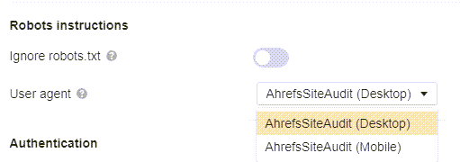
To test mobile parity via Site Audit, start two separate crawls. One with the user agent set to “AhrefsSiteAudit (Desktop),” and the other with “AhrefsSiteAudit (Mobile).”
You can then compare these crawls in the project history side by side to check for parity between the desktop and mobile crawls.
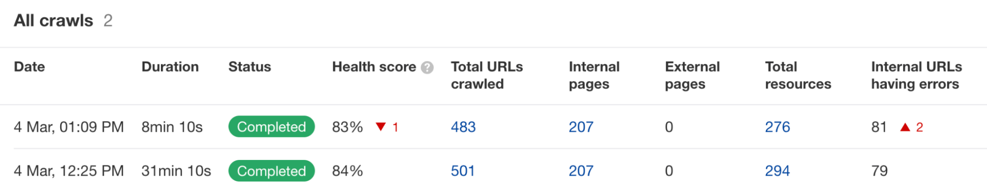
Notice significantly more errors on the mobile crawl compared to the desktop crawl? This can indicate that your technical elements aren’t being implemented correctly on mobile.
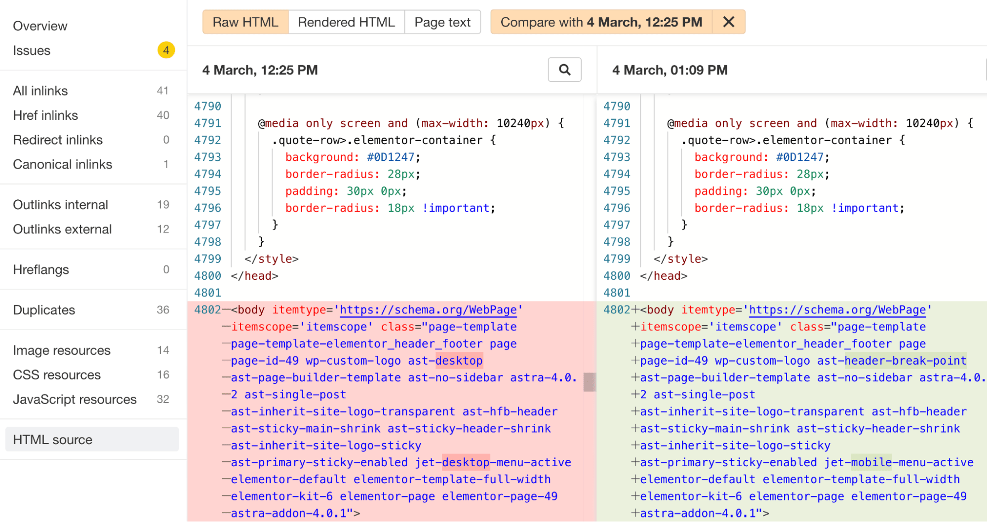
In Site Audit, it’s well worth comparing the HTML source code between your mobile and desktop crawls. This allows you to easily identify any unexpected differences between the mobile and desktop code of your page.
In the example below, we can see that the header menu code has changed between the mobile and desktop crawls. Luckily in this case, this code difference is expected.
You should also consider rendering JavaScript in the crawl settings for websites that heavily rely on that. You can then compare the rendered HTML between the crawls with different user agents. Check our guide to JavaScript SEO for more information.
Tip 8. Avoid intrusive interstitials
Interstitials (also known as pop-ups) that are intrusive and distracting are frustrating for users. This is often an even stronger frustration for mobile users, as pop-ups often take up an even bigger portion of the screen.
Not only could you be decreasing your conversion rate with annoying and intrusive pop-ups, but you’d also get a thumbs-down from Google.
As part of Google’s Page Experience set of ranking signals, Google approves more subtle interstitials as opposed to the large interstitials that cause great frustration.
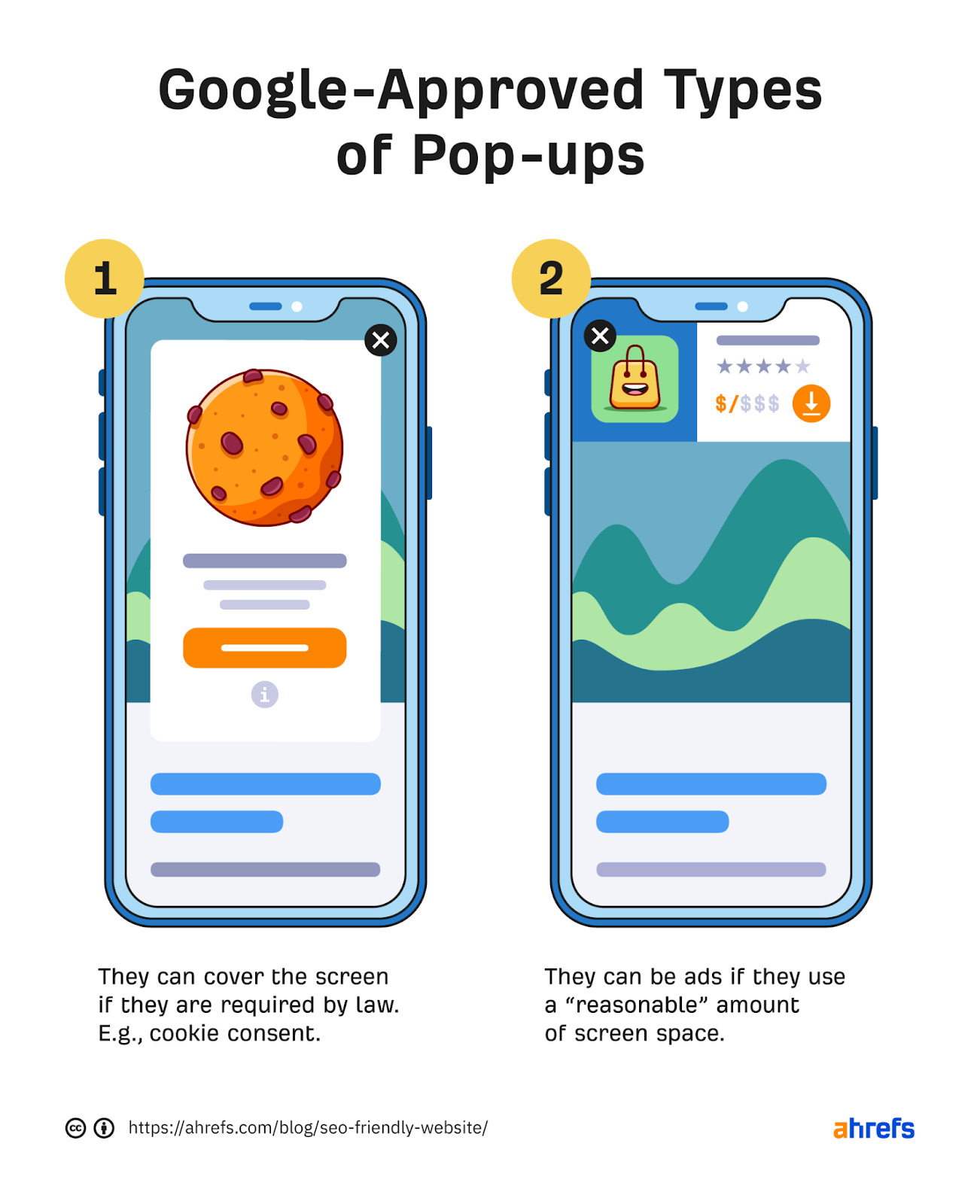
The big exception to the rule here is that the interstitial may be required by law. Common examples include cookie consent and age gate pop-ups.
For example, on alcohol-related content, the supplier could land in hot water if they didn’t force a user to enter their date of birth before accessing the content.

Tip 9. Review mobile performance
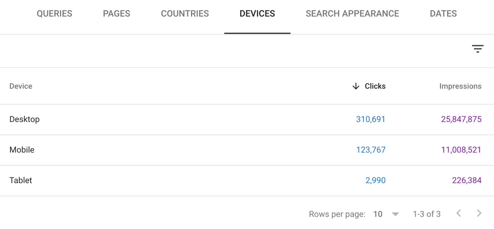
It’s good practice to regularly review the devices that drive your website’s organic traffic.
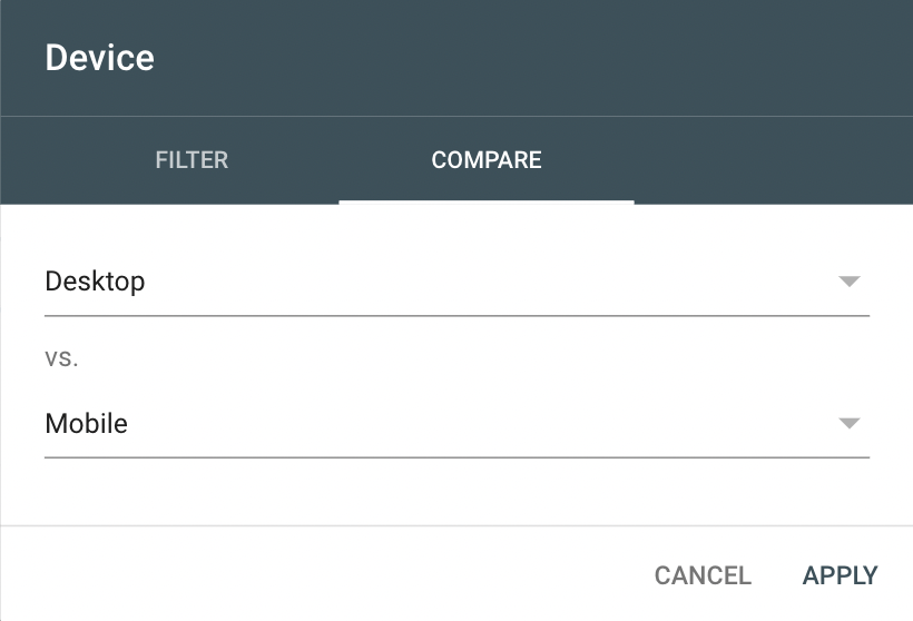
Starting off with GSC, you can filter by device type in the search performance report.
Simply add a new filter by clicking the “+ new” button above the report and select “Device…”
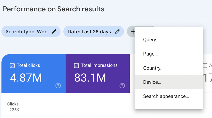
Here, you can filter your organic performance report via device, allowing you to see just how much organic traffic you’ve acquired via mobile devices. You also have the option to compare traffic by device.
Similar to the “Mobile Usability” report in GSC, it’s worth keeping an eye out for any unexpected fluctuations and traffic drops in mobile traffic. This can be a sign of mobile optimization issues that need further investigation.
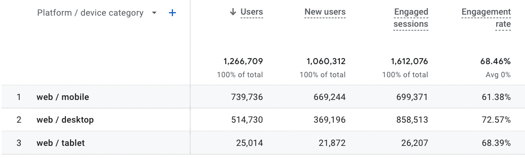
You can also view traffic by device in Google Analytics 4. Head to the “Device Category” report by loading Reports > User > Tech > Overview.
Here, you’ll want to click “View platform devices” for the full analytics by device.
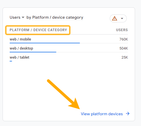
You’ll then be presented with data tables, charts, and graphs based on traffic by device type. Don’t forget to add an organic traffic filter to ensure you’re looking purely at “SEO traffic.”
Tip 10. Track rankings on a mobile device
When it comes to tracking keywords, it’s easy to forget that rankings can vary between the desktop and mobile SERPs.
Luckily, switching between desktop and mobile on Ahrefs’ Rank Tracker is simple, making it super easy to see how your site is ranking on either SERP.
What’s also great about Rank Tracker is that you don’t need to specify a device as a setting when you first track your keywords. Keywords are automatically tracked within both the mobile and desktop SERPs.
Simply load your keyword report and switch between mobile and desktop reviews in the top left corner.
Final thoughts
You may be wondering, “Should I just ditch the desktop version of my site and focus on mobile optimization?”
Steady on. It’s true that mobile is now the dominant device, but you won’t want to completely disregard the desktop experience.
Not only will some of your users visit your site via desktop, but Googlebot will also crawl via a desktop user agent from time to time (just not as frequently as the mobile version).
In fact, many websites continue to predominantly drive traffic through users on desktop. This is particularly the case for SaaS companies and many B2B-focused websites in general. For example, the Ahrefs Blog has over 70% of organic traffic coming from users on desktop devices.
To sum it up, the key takeaways are to:
- Show the same content on your mobile site as you would on your desktop site.
- Understand that responsive design is the way to go.
- Prioritize your mobile pages for page speed optimization.
- Not be afraid to use the hamburger menu for mobile devices.
- Regularly monitor and track mobile usability and mobile traffic/rankings.
Have any questions? Ping me on Twitter and let me know.